เริ่มต้นใช้งาน
Sign in and find your way around
Get into Nerve, read the two-level sidebar, and understand why your menu is built from your permissions rather than from a fixed list.
อัปเดตล่าสุด
Who this is for: everyone with an account — no permission is required to sign in or read your own dashboard. Where: the sign-in page, then Dashboard
Before anything else, one idea that explains most of what follows:
Your navigation is built on the server from your own permissions. It is not a fixed menu with some items greyed out. Two people at the same hotel, signed in at the same time, legitimately see different sidebars — and neither of them is broken.
Sign in#
- Open the property's Nerve address. You are sent to the sign-in page.
- Enter your e-mail and password.
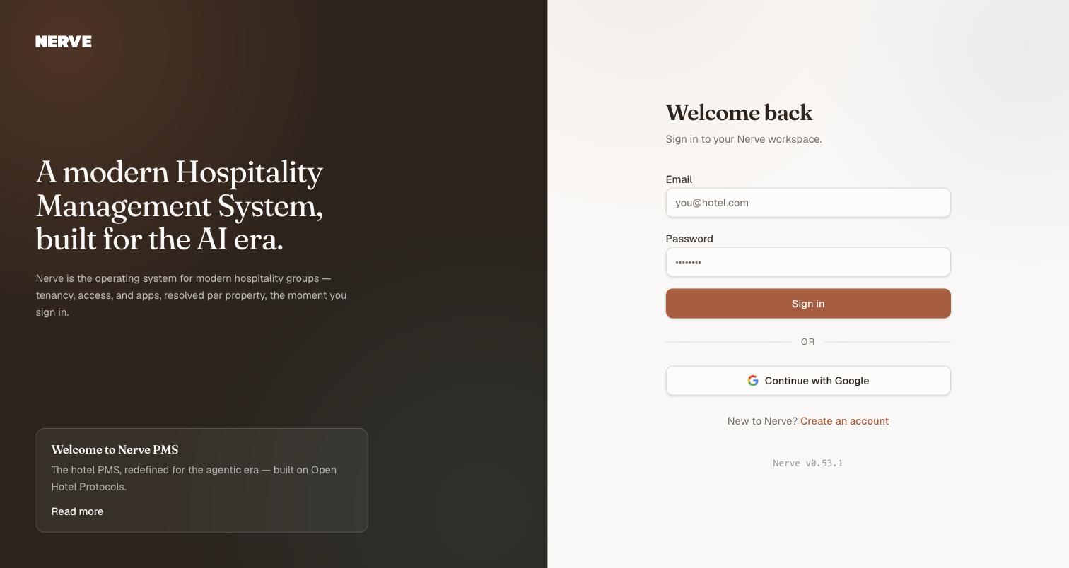
Everything on the left of this page is editorial. The card at the foot is a post from Nerve's own blog, and Read more opens it — nothing there is specific to your property, and nothing there needs your attention before you sign in.
A wrong password produces an inline error and creates no session. From there:
- If your account reaches exactly one organisation with exactly one property, you go straight to the Dashboard — there is nothing to choose.
- If it reaches more than one, you land on the picker first. See workspaces, organisations and properties.
Your session survives a page reload. A hard refresh shows a brief Restoring your session… state and then re-renders the page you were on — it does not bounce you back to sign-in.
Sign out#
Use the account menu at the foot of the sidebar. You are returned to the sign-in page, and pressing Back does not reveal application content behind you.
Read the sidebar#
The sidebar has three parts, top to bottom:
- The property switcher, in the header. It names the property you are working in and the organisation above it.
- The navigation, in the middle.
- Your account, in the footer.
The navigation is two levels, as a drill-down rather than an expanding tree.
Level one lists Dashboard, then one group per app, then Workspace, which holds Settings. Each app group carries a count of the screens inside it.
The apps that can appear are Front Desk, CRS, Housekeeping, Accounting, Revenue, Inventory, Point of Sale and Integrations — but you see only the ones you can reach. A read-only account at a property may have four groups and no Workspace at all; an Owner sees every app switched on there.

Level one. The number beside each app is a count of the screens inside it, not of apps — and the list itself is built from the resolved permission set rather than from a fixed menu.
To go deeper:
- Select an app to drill into it.
- Level two lists that app's screens.
- Select the app's name at the top to come back out.
The open group follows the page you are on, so a bookmark or a pasted deep link opens inside the right app rather than at the top level. Peeking into another group is temporary — navigate, and the menu snaps back to where you actually are.
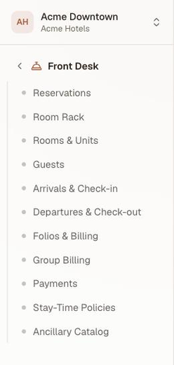
Level two, after drilling into an app. The chevron beside the group name is the way back out.
Understand why your menu differs#
Three things must all be true for a screen to appear:
- Your role carries the permission that screen requires.
- The app that owns the screen is enabled on this property.
- You are in a context — an organisation and a property — where that role applies.
So a colleague's missing menu item can mean a different role, an app switched off for their property, or that they are looking at a different property from you. Why your menu differs from a colleague's works through it — with the same sidebar photographed under two roles, and with the fourth reason, the one Nerve holds rather than you.
สำคัญ
A screen you cannot reach is not hidden-but-present. Typing its URL directly returns an unauthorized state that does not reveal whether any data exists behind it. Nav filtering is a convenience on top of real enforcement, not the enforcement itself.
Read your dashboard#
The Dashboard is the shell's front door — the first thing an account with rms.analytics.read sees after sign-in, and a peer page rather than a screen nested inside Revenue. An account that does not hold that permission (Housekeeping, for instance) is told so plainly rather than shown an authorization error.
It carries two tabs, because it answers two different questions on two different clocks:
| Tab | Answers | Scoped to |
|---|---|---|
| Performance | How did this period do — occupancy, ADR, RevPAR, revenue, and the mix behind them | A date range you pick |
| Operations | What is happening on my shift right now — arrivals, departures, room readiness, house status | One business date |
Only one date control is ever on screen, and it belongs to whichever tab is active — a range picker on Performance, a single date on Operations.
Performance opens on today through today plus thirty nights: eight KPI cards (occupancy, ADR, RevPAR, room revenue, room-nights sold, F&B revenue, MOD revenue, total revenue), a daily bar chart for four of them, and a segmentation table you can pivot by source, channel or company. This is the screen revenue analytics documents in full — including what each metric means.
Operations opens on today: four numbers for the day's arrivals and departures (how many, how many done, rooms ready, still unassigned), the arrivals and departures lists themselves, and — for an account that also holds housekeeping.status.update — the house's live status: occupied, vacant, dirty, out of service. House status carries no date; it is the floor as it stands right now, labelled as such rather than quietly inheriting the tab's date.
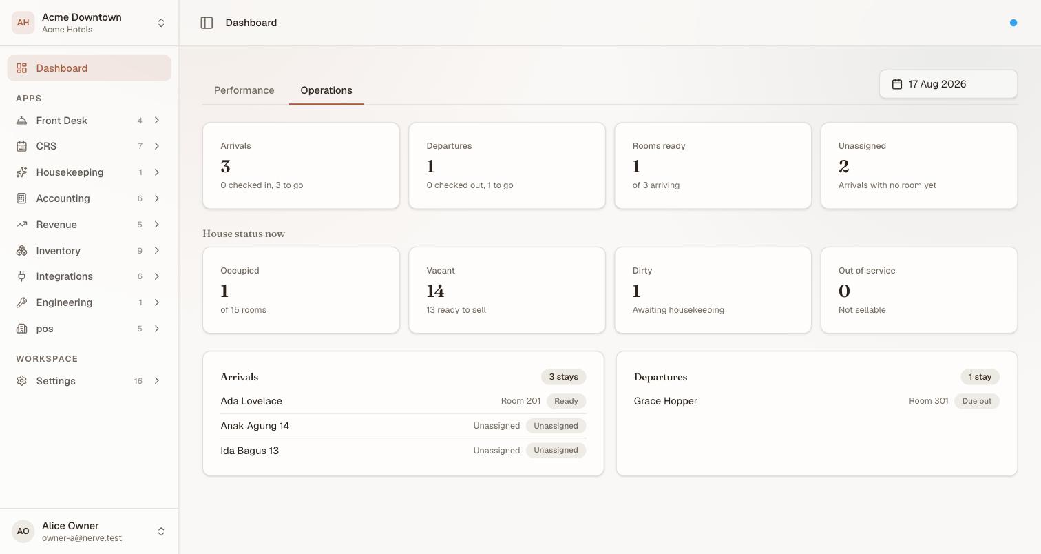
A shift's worth of facts on one screen, all for one date. House status carries no date field of its own — it is what the floor looks like right now, whatever date the cards above it are reading.
หมายเหตุ
Rate parity — whether a channel is still selling the price you last intended — is not on the Dashboard. It used to sit at the foot of the analytics screen; that card is not part of the current Dashboard.
Check which version you are running#
A small coloured dot sits at the right-hand end of the app header. Select it and a System status panel opens.
Nerve is versioned as separate parts, and they move independently. The web app you are looking at and the API behind it are released on their own schedules, and a deploy routinely moves one and not the other. So the panel gives you two numbers rather than one — which is exactly the thing to quote when you report a problem, because "it broke after an update" is not answerable without them.
The web app's version is also printed quietly under the sign-in form, so you can read it without an account.
The service status board underneath is a live check of Nerve's own services — the API, the database, sign-in and email delivery — measured afresh each time the panel refreshes. It is not a reading of your property: it knows nothing about your hotel, your data or your session, so it is not where you diagnose a problem with one screen. The dot in the header takes its colour from the worst service currently reporting.
หมายเหตุ
A blue dot does not mean your work is fine, and an amber one does not mean it is at risk. If a screen misbehaves while the badge is blue, the error on the screen itself is better evidence than this panel.
System status reads the panel properly — including what Not wired means, which is the row most often mistaken for a fault.
What's next#
- Revenue analytics — the Dashboard's Performance tab, metric by metric
- System status — the badge in the header, and what each state means
- Workspaces, organisations and properties — switching between them
- Why your menu differs from a colleague's — the three-way gate in practice
- Your first week on Nerve — if you are the one setting the property up